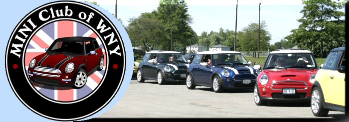
Thanks Dave! I kept getting mad at myself for not using any of the new logos that Cooperation had designed for us, and with the nice new logo, the old Orange/White/Blue scheme really looked bad... luckly, there was a nice blue theme available for use without any sort of fussing around on my part. I'm glad you like it.
dedestaud wrote: Considering the fact that the new logo was not voted for! I said before and I'll say it again. The letters "L", "U", "B" and "O', "F" ARE NOT CAPITALIZED!!!!!! I started this club 4 years ago and I don't appreciate being inched out.
Personally, I wouldn't put MINI in all caps, because it can be interpreted as excluding Classic Mini owners, but that's just my interpretation. I think most logos of this nature & signs, for example, are done in caps because they are easier to read than mixed type and more noticeable.
I think most importantly that a club is about having fun, and I'd hate to lose sight of that.
There is a reason for the way it is. When the name was being developed a lot of discussion went into it. The MINI represents the new ones. The reason for the lower case is to represent the older ones. The reason why there is no Cooper in the name is because it is for all Minis (Austins, etc.). On most computers it is easier to write across instead of in a circle so consistency can be maintained when typing out the name.
This is Craig (cooperation)...the logo that appears is actually the old version that was sent along a month or so ago. It was corrected since, but the new version just didn't make it onto the header here.
The typestyle used is a popular font called Copper Gothic. The lowercase looks like the uppercase but is smaller in size...here's a link to the full font...
I can't see the second one clearly because I have dial-up and it is not downloading completely but the second is clearly lower case, not the first one. The L and B and F in the first one is clearly in caps. I'm sorry if I offended anyone, that wasn't the intention. Maybe I took it too personally and yellowminy is right. Let's just have fun. Enough said.
A HUGE thanks for Craig/cooperation for the new logo... at the risk of being demanding, might we see the new versions with the Welsley Hornet in it also?
I'll start a new thread to Pick The Font... I like Copper Gothic, but I've always liked sharp edged fonts over rounded...


 ...don't worry, I haven't used it before and if I need to reply to any responses, I will register.


